How to Design the Look of Film Characters - Making of “Artificial Intelligence”
I'm finally going to start sharing the BTS and the story of working on my film. "Artificial Intelligence" (which as of today is finally nearing completion). It's a post-apocalyptic/sci-fi film that'll run about 15 minutes or so.
This first piece of concept art of “Zipp’s Gang” is one of the first pieces of work that were completed to make this film happen. But even before this, I was working with artist Travis Wright to create concept art for another project which never came to fruition - including failed crowdfunding campaign and all. You know the story. Every filmmaker has one.
You can tell by the date on some of the concept art that I have been planning for this "AI" film since 2019. It's been a long process.
The concept art for all the characters in the first scene was a very important step in the creative process because it gave us something to work with to create these characters out of thin air, and to not just make them each generic "hi i'm postapocalypse guy, look at my camo pants and dirty, ripped white tshirt" guys you see in a lot of indie stuff.
And even the concept art was an iterative process, working back and forth with Travis.
My first step, always, was to provide character descriptions and a folder with various visual style references for him so he had somewhere to start. It was a learning process for me to figure out how to best communicate my sense of style that I was going for to Travis (and therefore the vision) and make his job as easy as possible.
I learned an important lesson over the past couple years working on this project and others.
When working with other artists - whether they be concept artists, editors, or anything else - the bottom line is that if you don’t provide much guidance, given that you probably had a look in mind that you like (even if you don’t have strong feelings about it), this can lead to disappointment for you if the artist does something totally out of sync with your vision, and it will be frustrating for the artist, who was simply doing their best without clear direction.
After Travis provided the first few concepts, I would often give him some simple feedback and notes with various characteristics he could meld together into a better, more final, result.
You can see below a finalized version of the concept art.
You can hopefully see the clear resemblance from the final concept art to screen (sorry, if I had better before and after photos I'd provide them), and how we used the concept art as references to create the final look for each character.
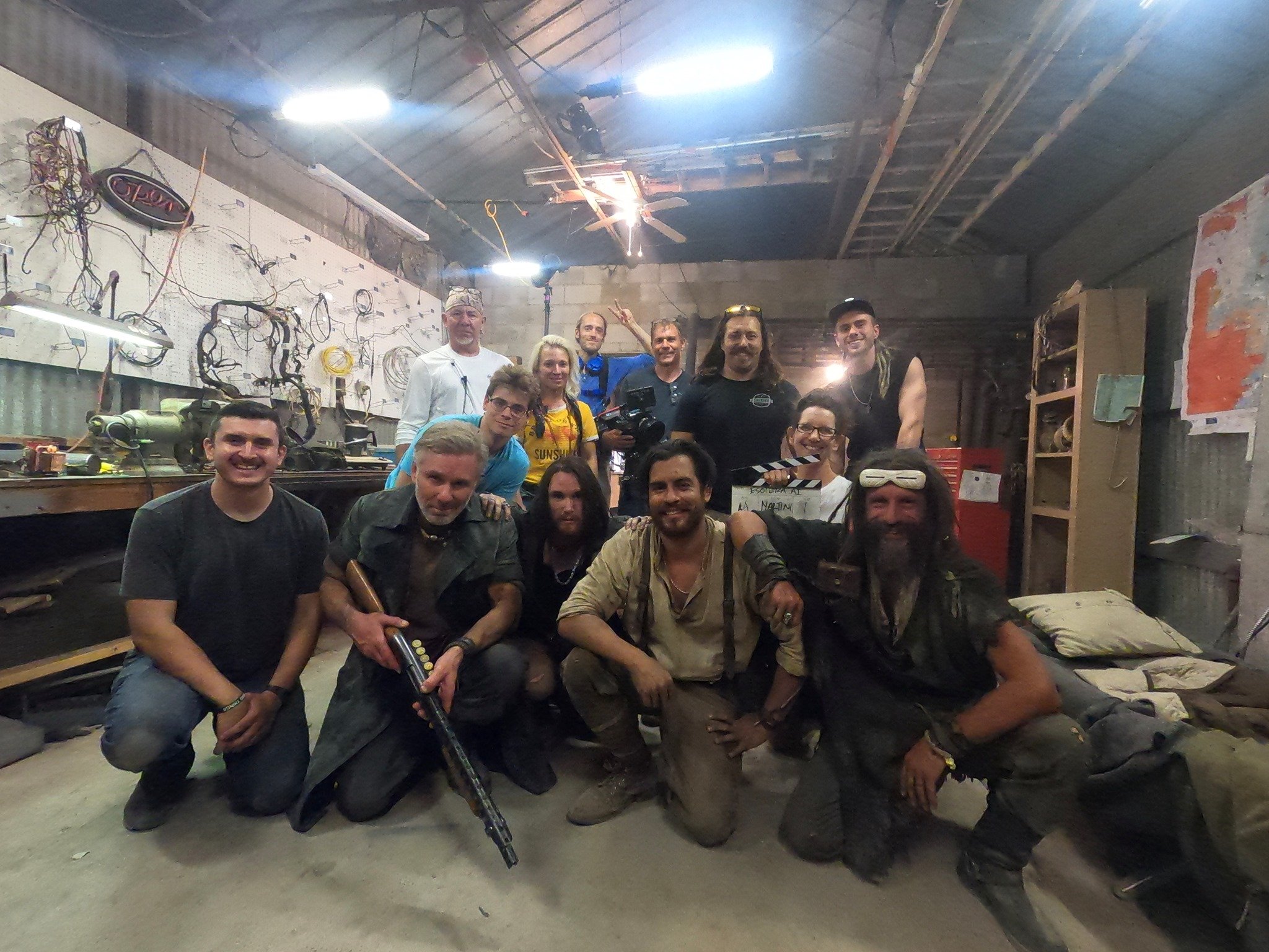
It was quite the learning process for me and I couldn't have put these costumes together without the awesome Lemonade Acre team (Bert & Trina Boutin), partly because it is an iterative, layering process and it helps to have a couple people to brainstorm with, but also because it's just too much freakin' work for one dude.
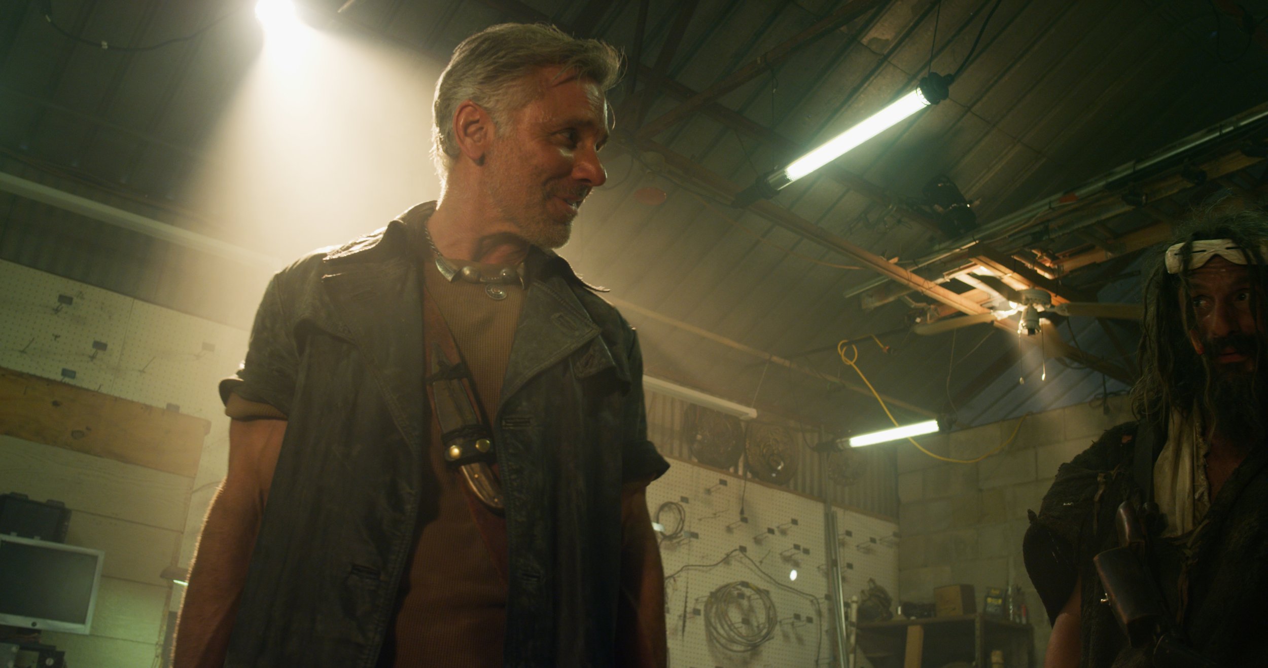
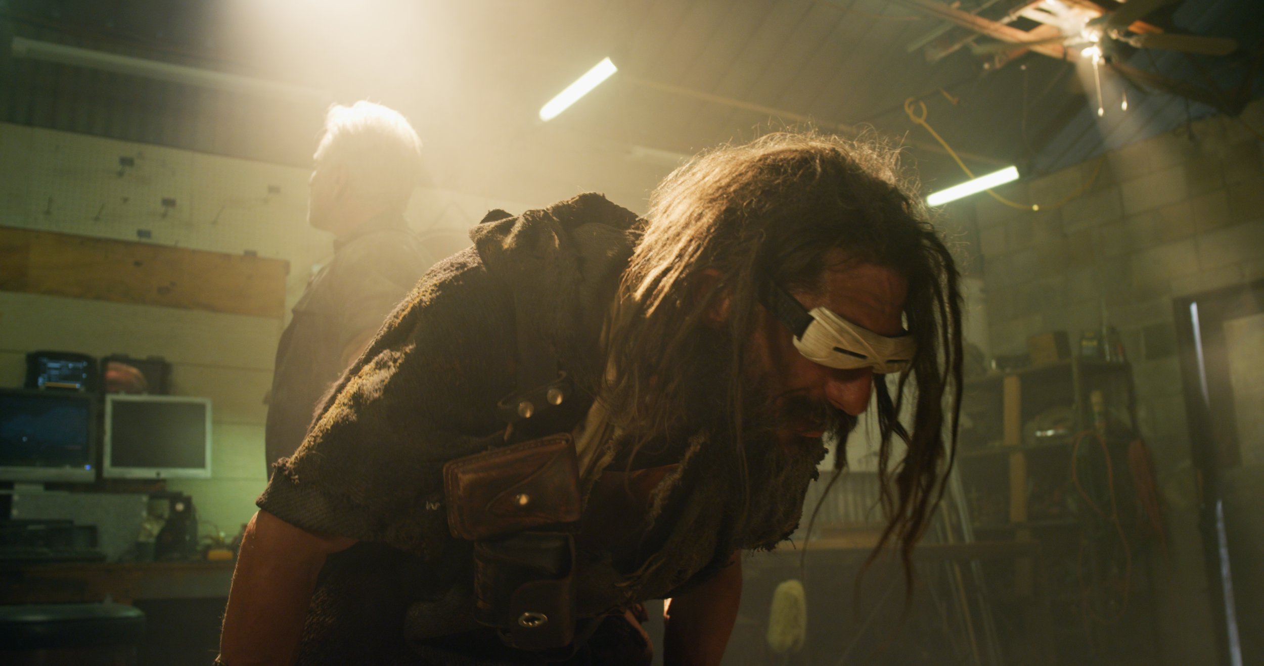
We continued using this process for each and every character, and I have to say I have found it to be labor intensive but incredibly helpful. And it works. I haven't ended up with one costume I haven't really liked. And the great costumes, carefully designed for style and function, help bring the viewer into the world by showing, not telling.
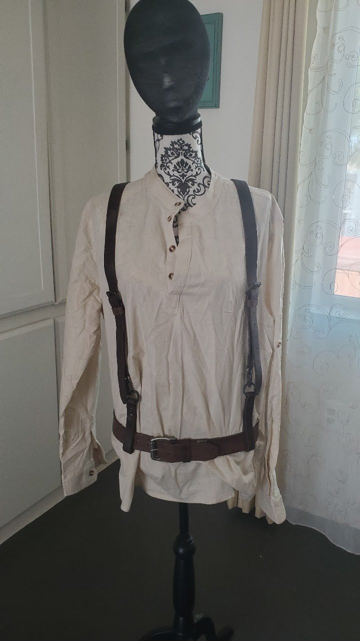
I have further examples of this iterative process - which really seemed to be the key, from concept to final costume. Adding layers 1, 2, 3, 4 of details from the large to the small really fleshed out our characters. (Pants and shirt, okay, now jacket and headware, then jewelry, tools, and other accessories, and so on.)
As things went on, I sort of realized that it is just like normal, real-world fashion. If you just wear jeans and tshirt, it’s pretty boring. Add some good boots, an accessory or two, another layer (maybe a jacket, scarf, vest, etc.), and you start to have a more interesting, layered look with contrast, various textures, and various colors.
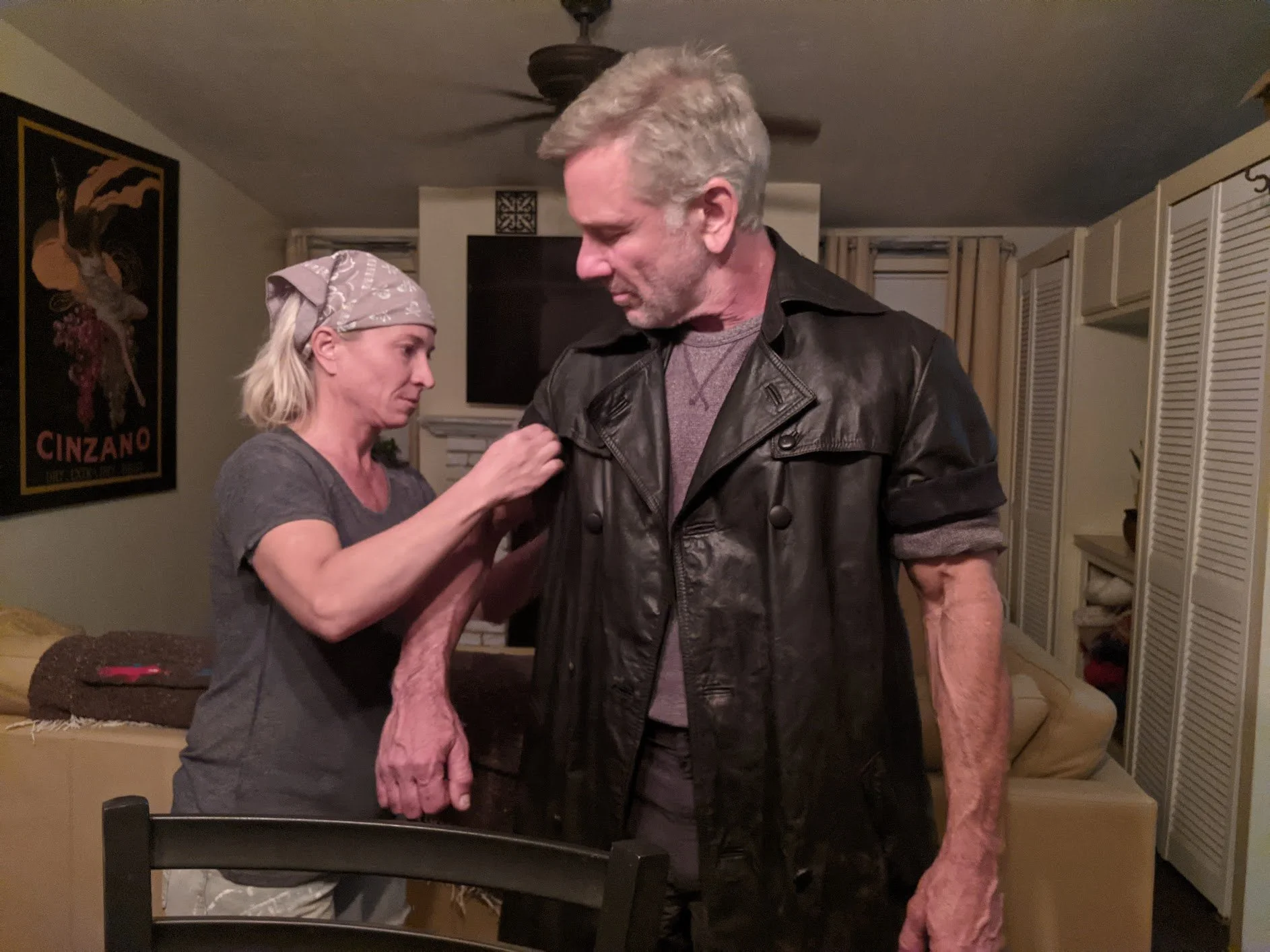
You can see the experimental process - trying different things for different costumes - in our various BTS photos. There are great photos in particular of the process of creating the main character’s (Jake) outfit.
Here’s the concept art for Jake.
For the first scene of this film in particular, since Jake is at home and relatively relaxed, as opposed to ready to go out into the wasteland and do dangerous work, his outfit is stripped down to barebones like someone might do working at home.
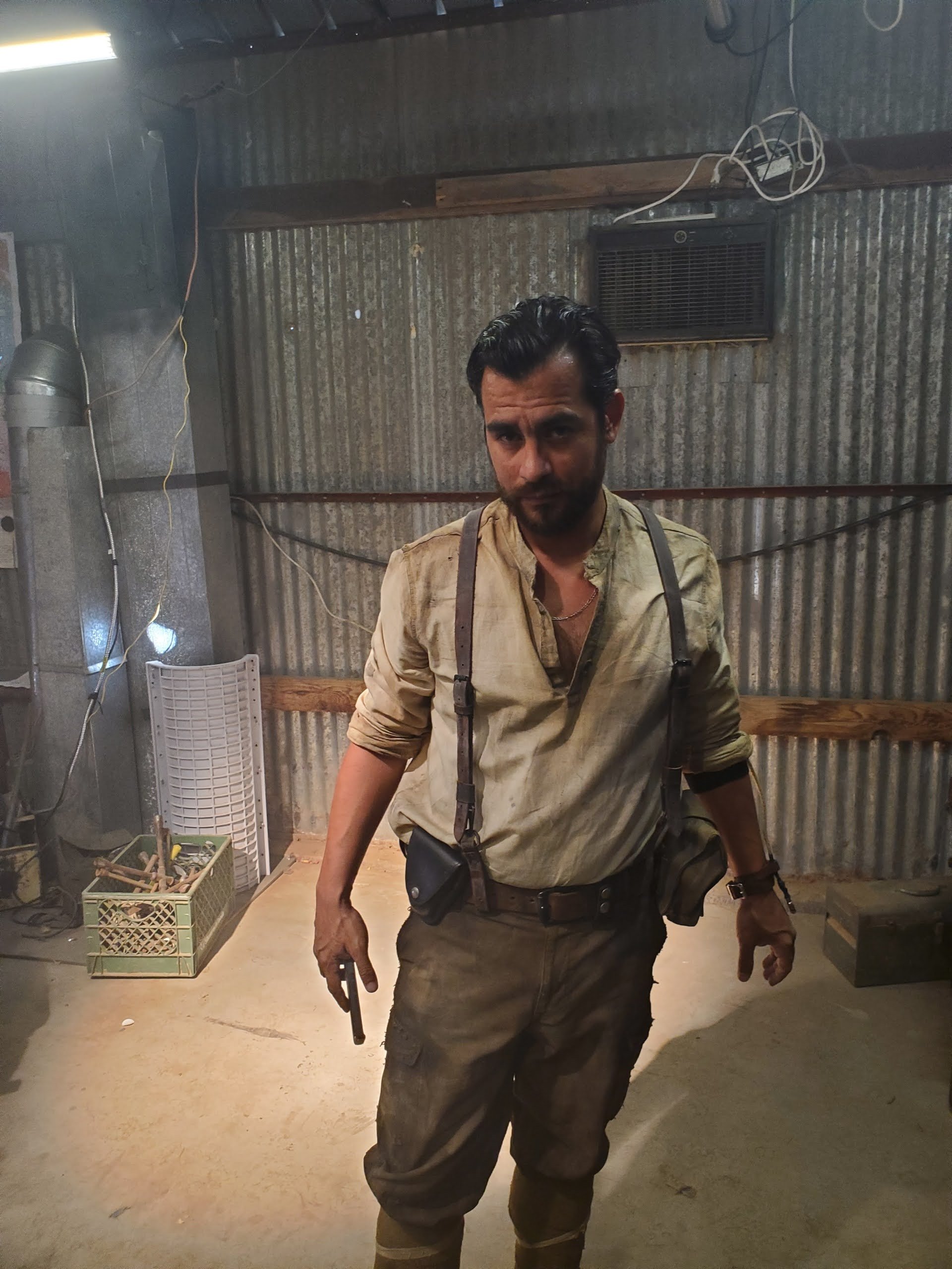
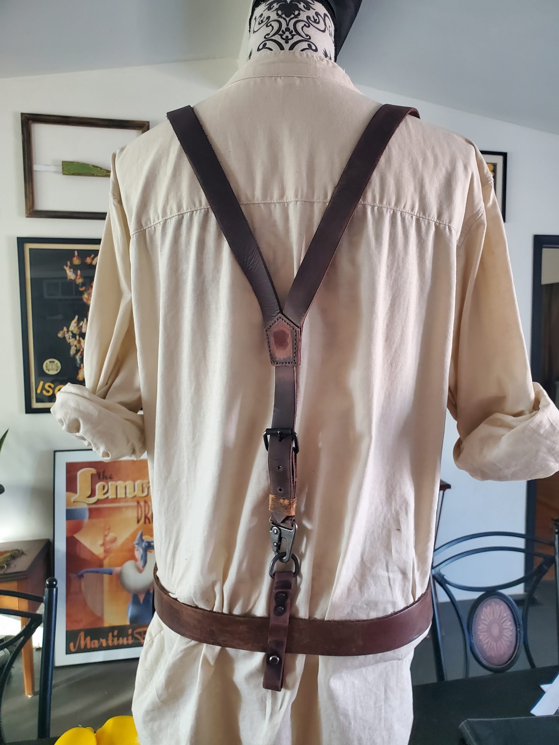
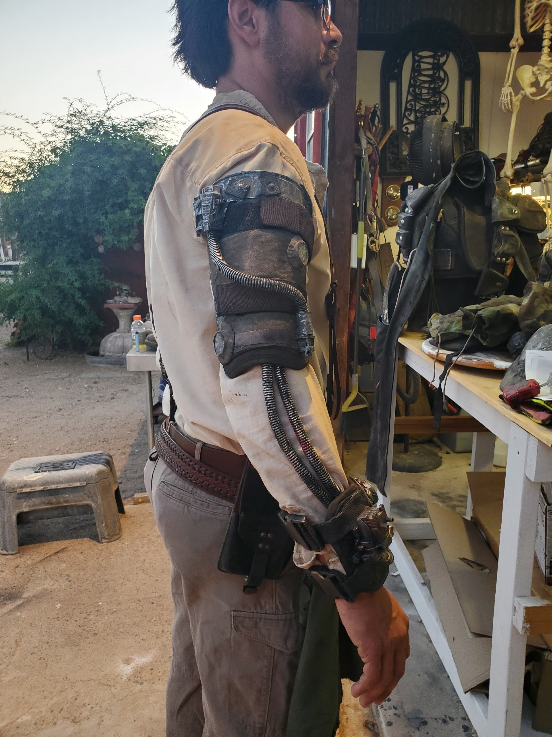
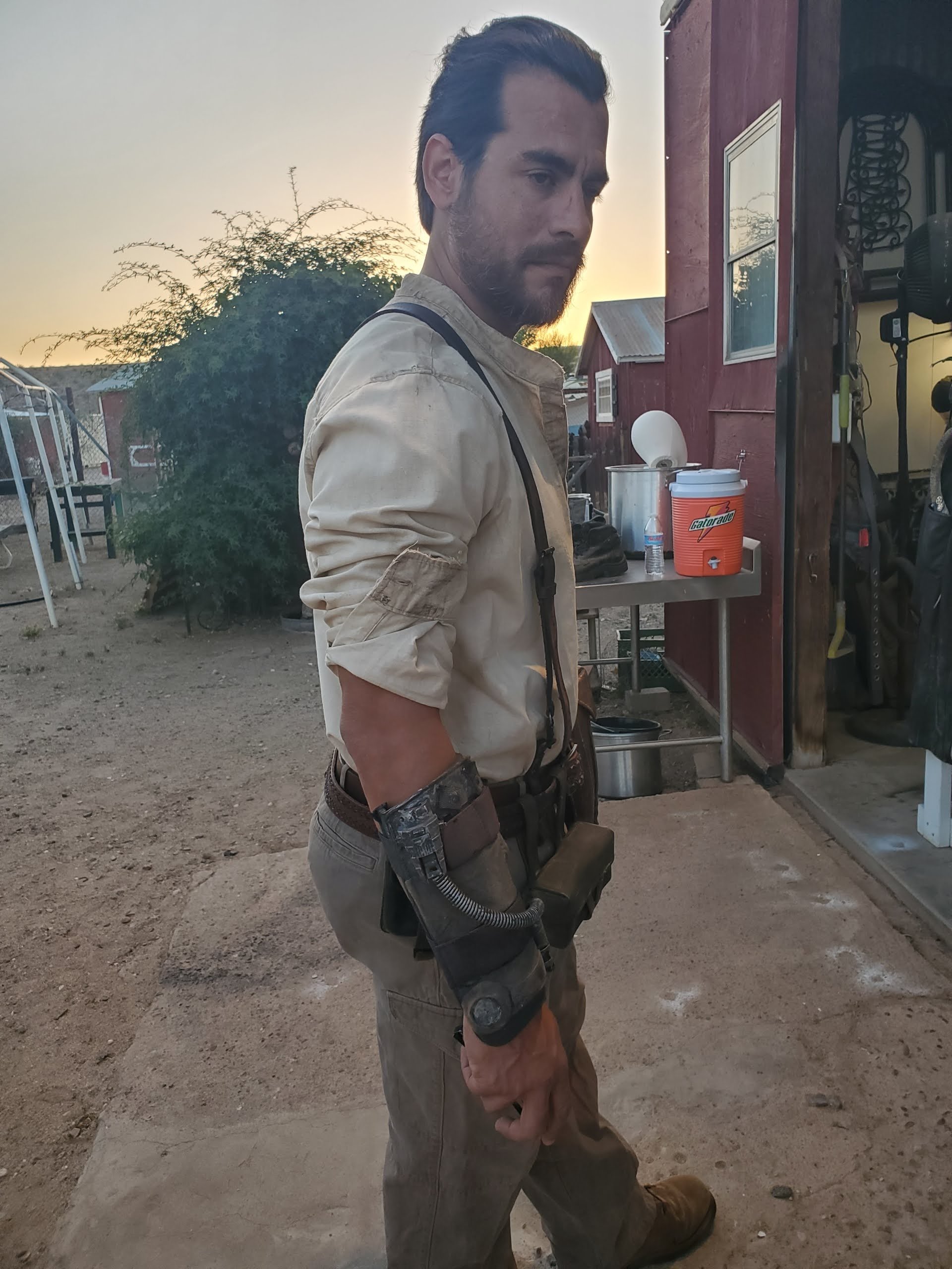
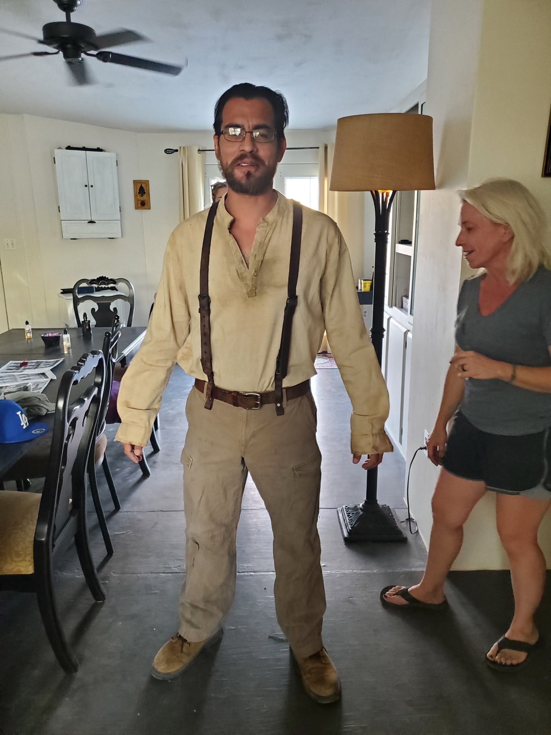
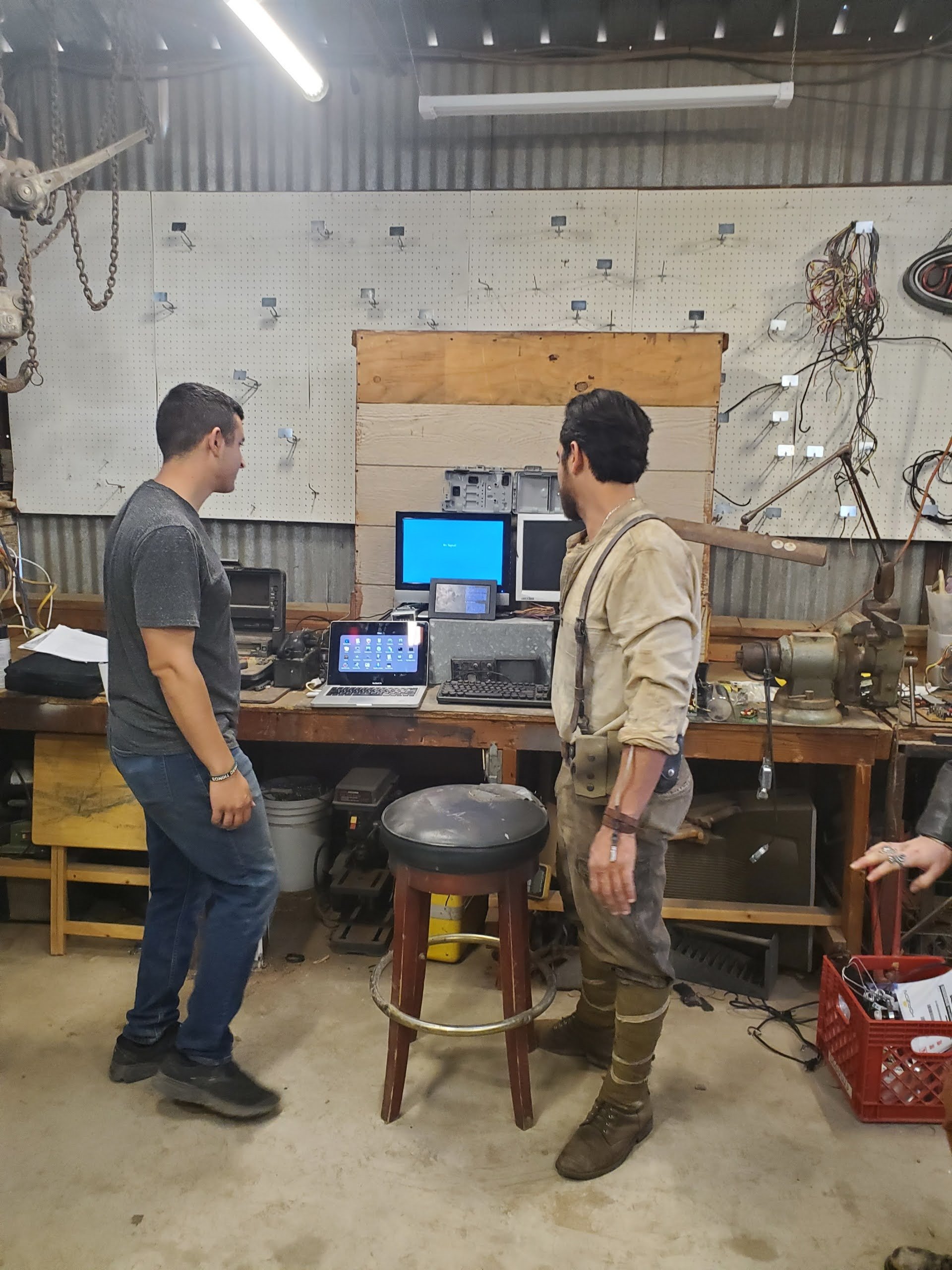
People don’t sit at home covered in gear, jacket, kneepads, and so on.
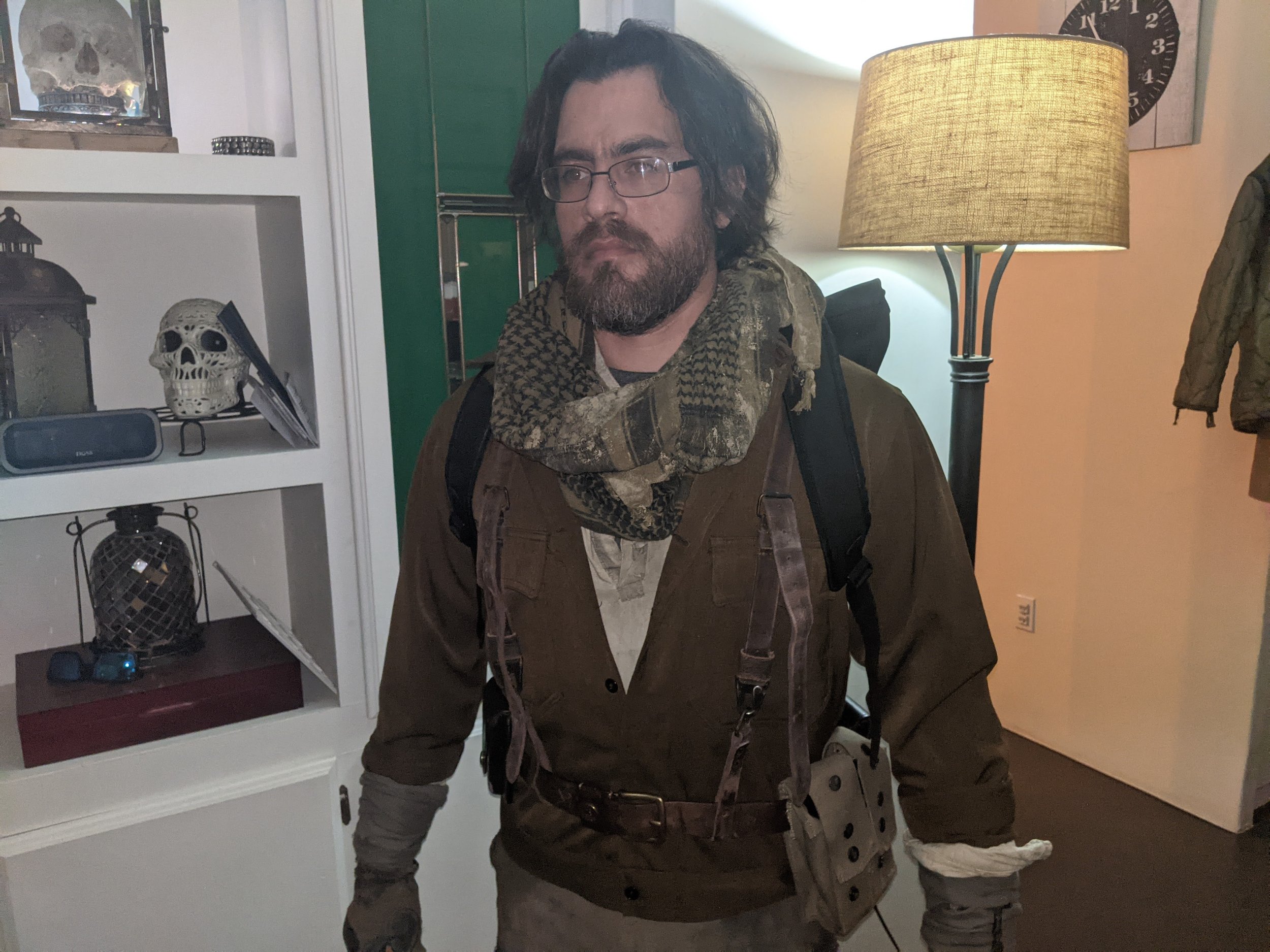
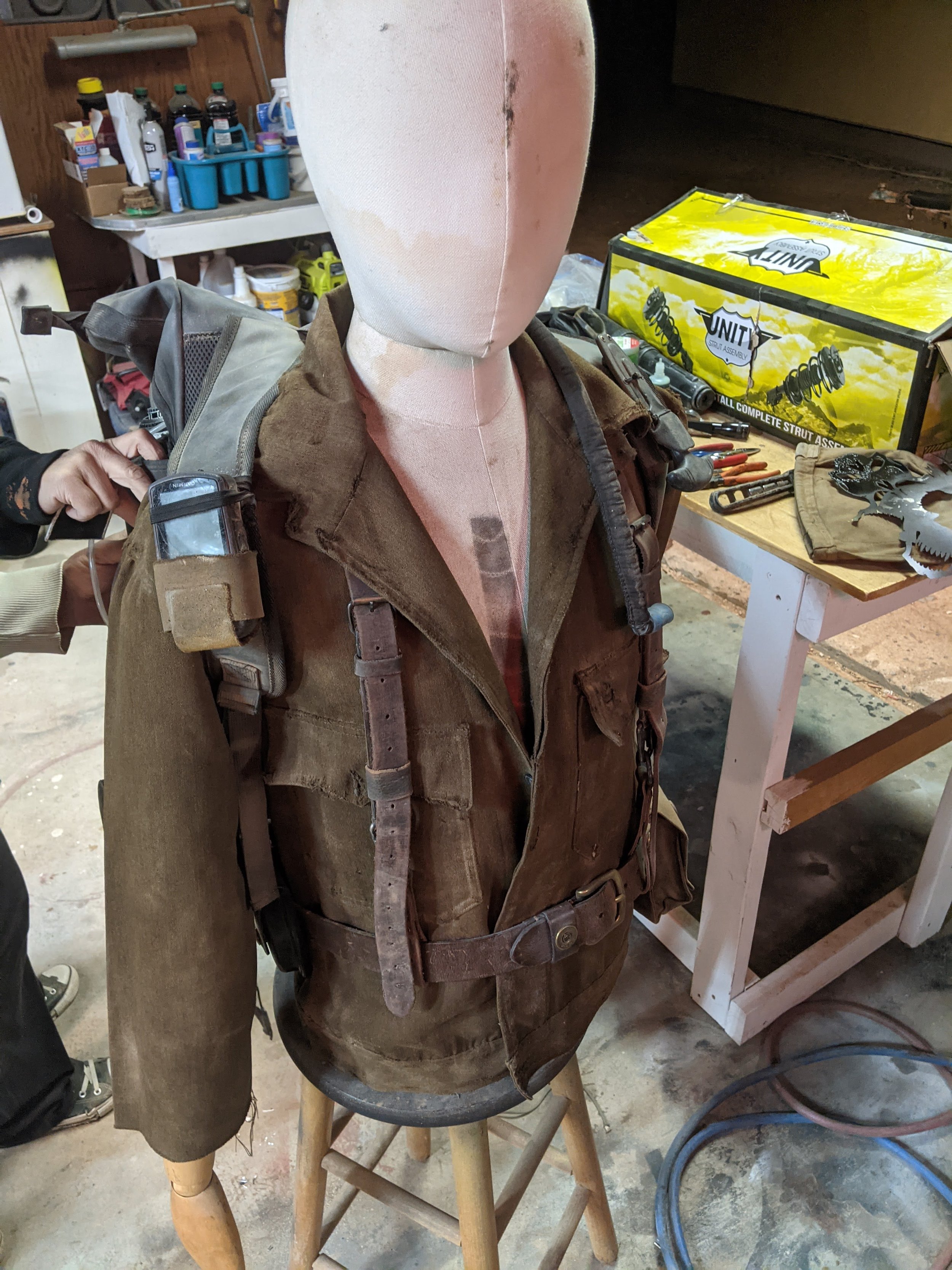
You can see in these images how some things work, some didn’t work so much, and eventually we landed on a look that I really liked.
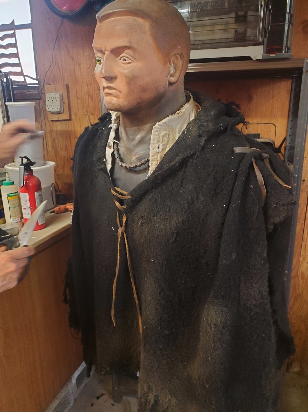
With each new costume item, there’s also a process of weathering. Obviously, many (though not all) of the costume pieces start out brand new, so even if this hadn’t been a post-apocalyptic film, the would have needed some work to make them look lived-in. It was just more exaggerated for our purposes.
The weathering was in layers too. Abrasion, tears, putting it through the wash to get rid of out-of-the-box wrinkles, to oil stains, sweat stains, and grime. All of these add layers of realism.
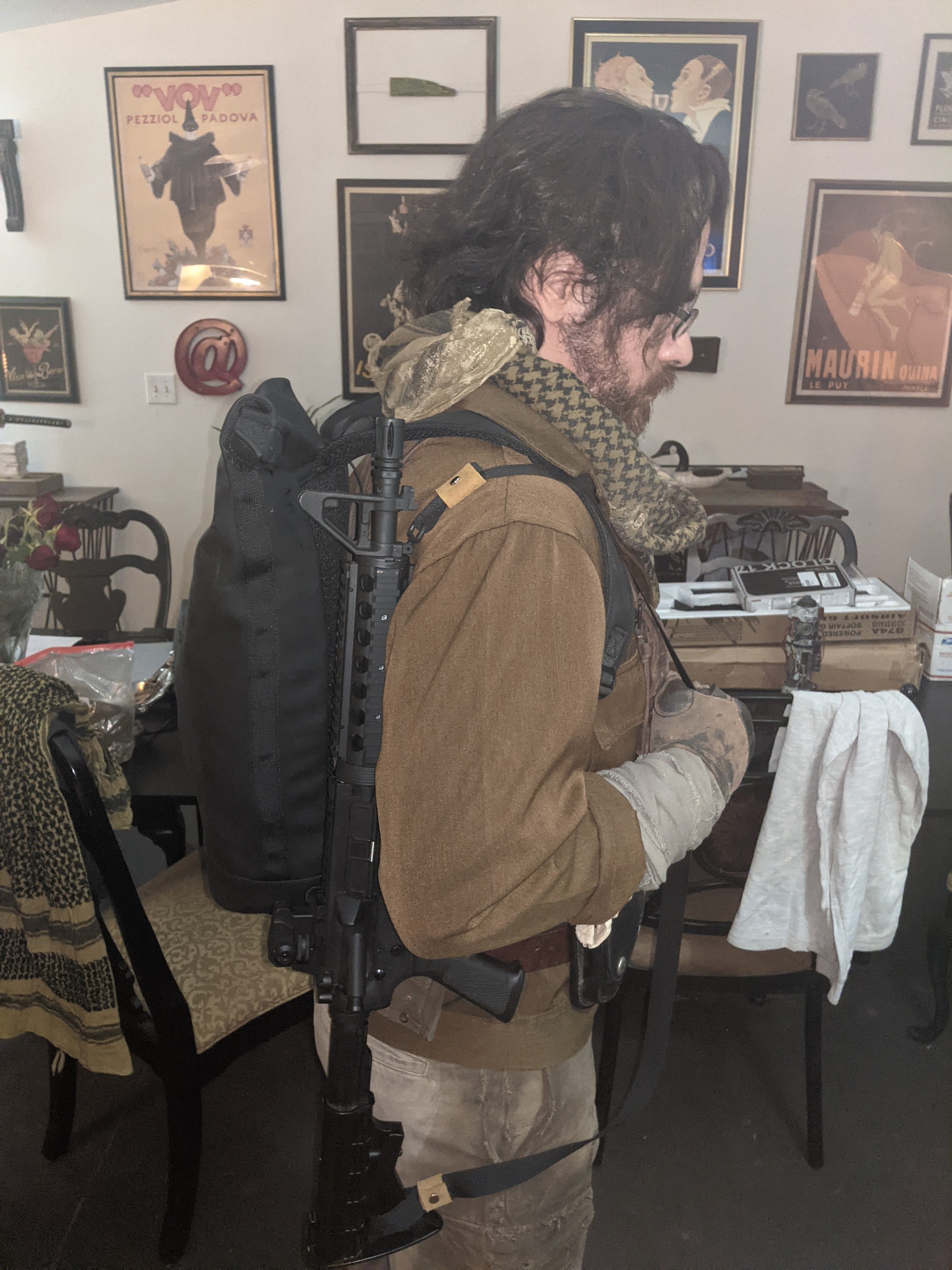
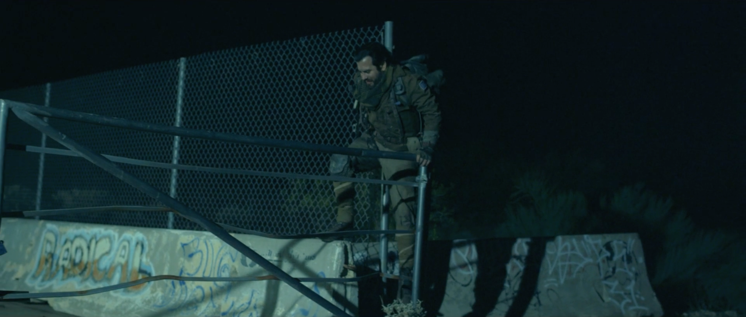
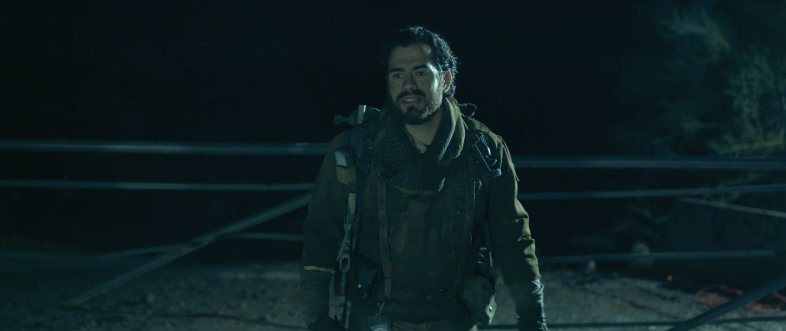
And last, but not least, for Jake’s outfit in particular, we needed to do an upgrade since in the film he gets some loaner gear so he can trek into the wasteland and complete a contract. This was going to be closer to the original concept art, with more layers and gear - Jake is prepared to work, and to fight, as needed.
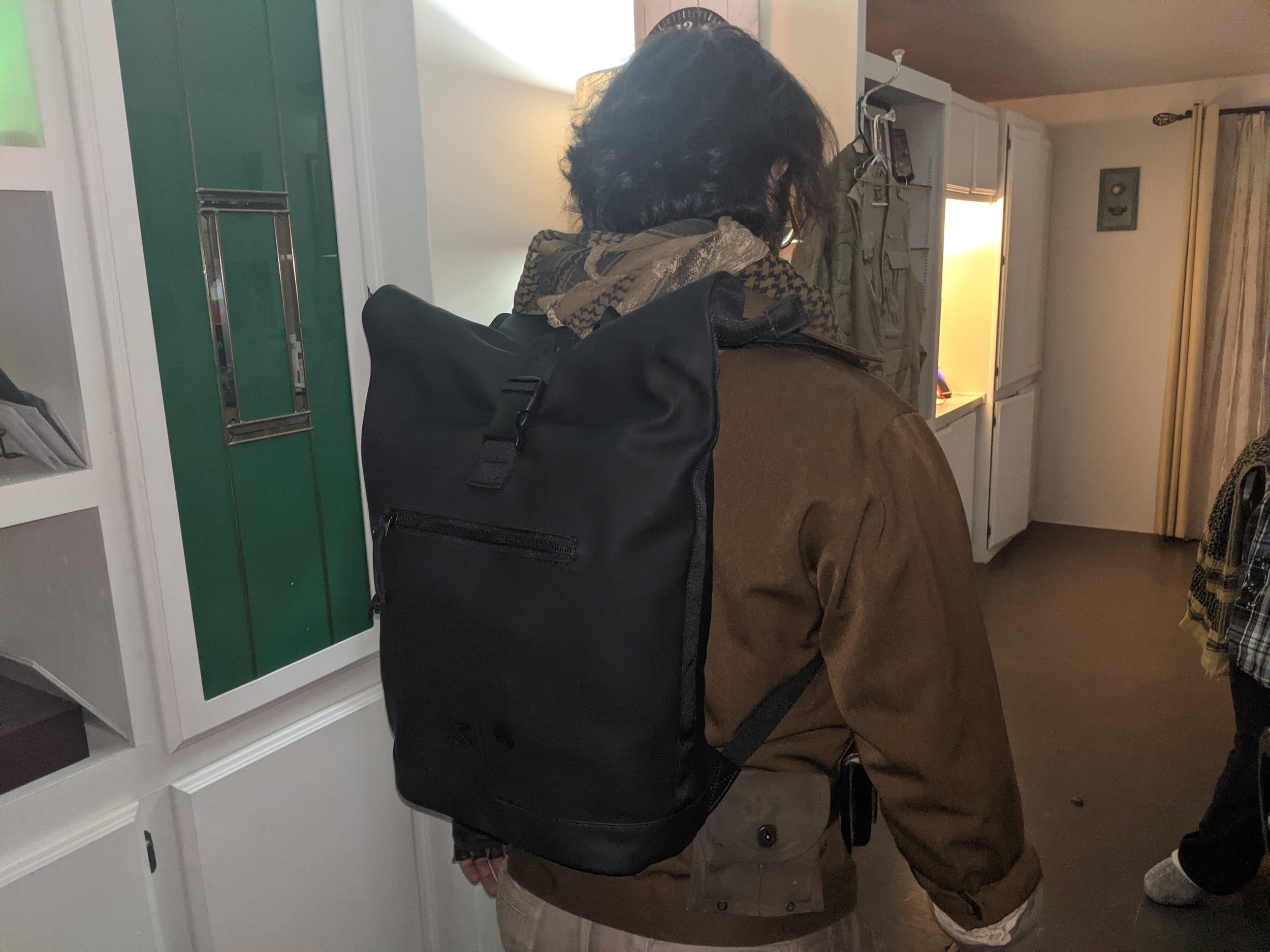
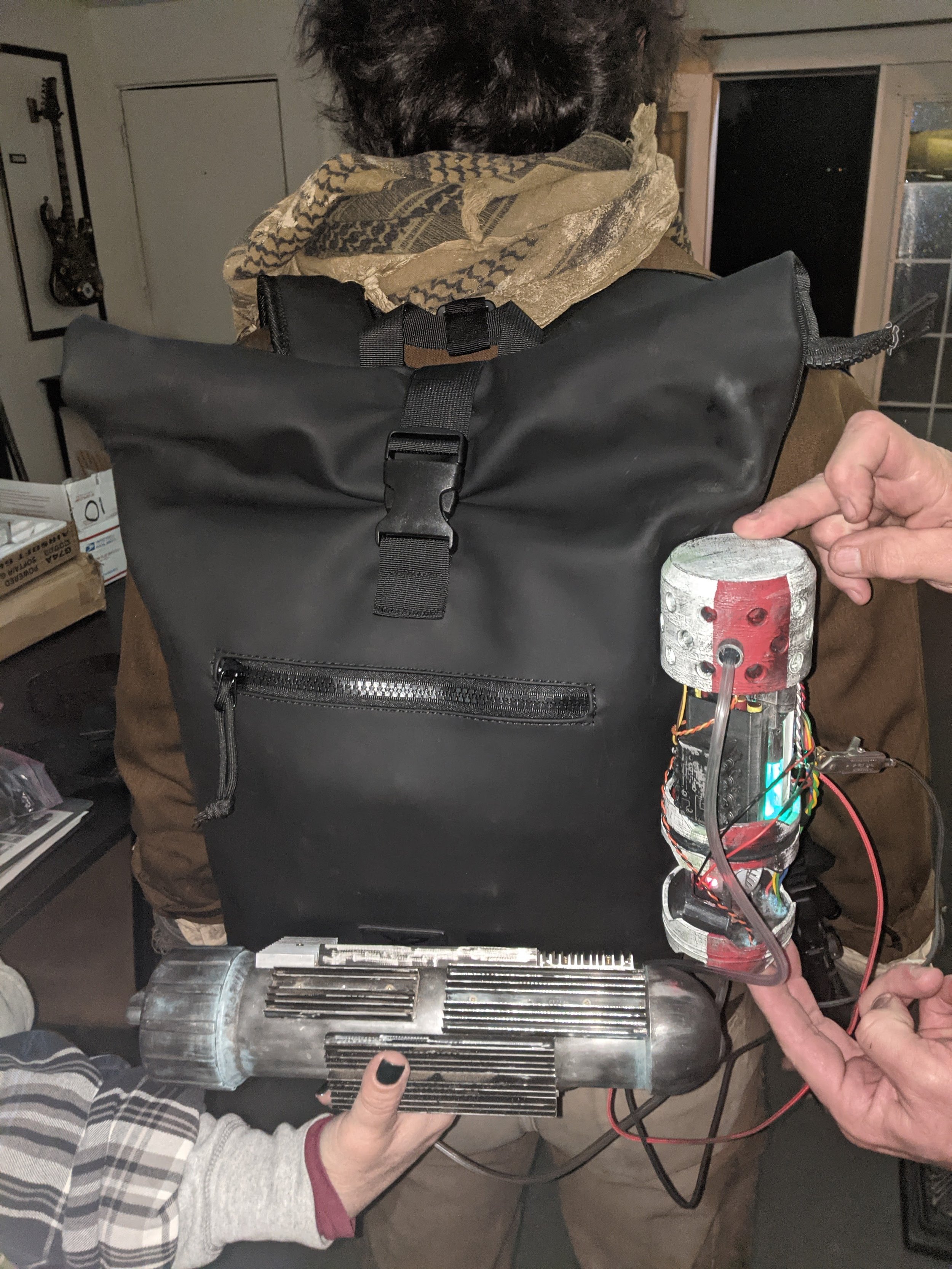
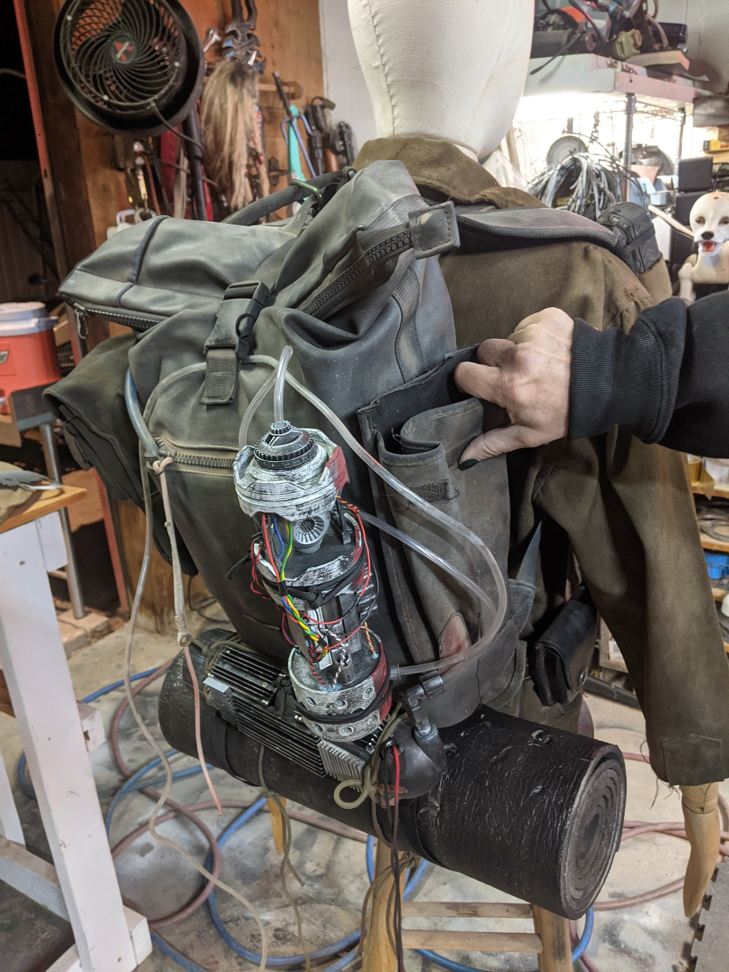
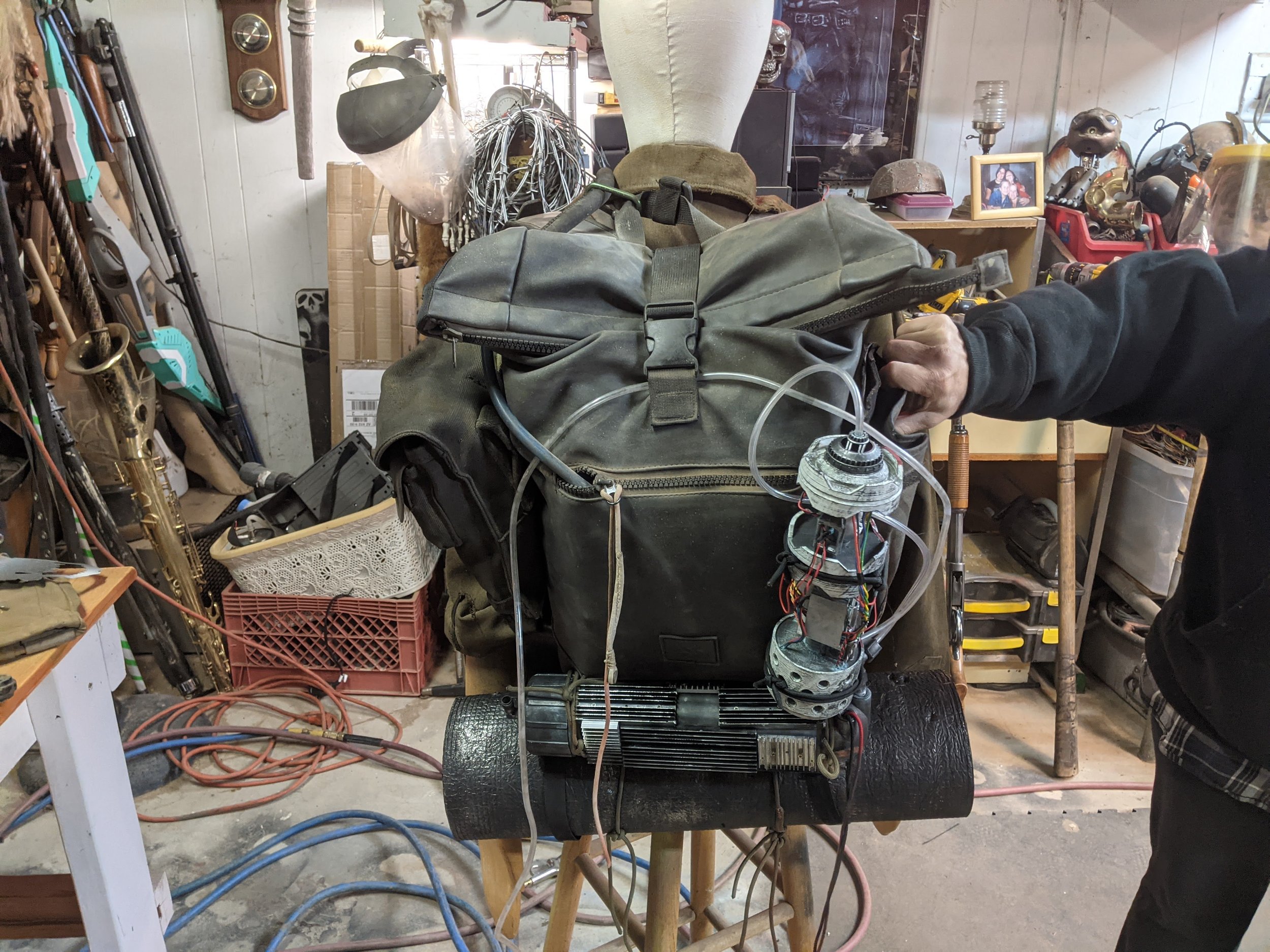
As far as the backpack goes, we went with a very artificial, modern looking material and style that would contrast with the rest of Jake’s costume, lending a more futuristic flavor instead of being more of the same sort of texture and color.
Jake’s outfit already had a ton of earth tones, natural fibers and textures such as wool, canvas, and leather, and so I wanted to avoid adding more. As it was, the costume already gave off strong WWI-WWII / Western vibes (which was my intent), so it needed some tech to balance things out and bring Jake into the future setting he’s in.
I feel that the backpack choice really helped.
If you’re wondering about the techno-looking bauble strapped to the backpack, I’ll explain that in another article where I’ll talk about prop creation, and specifically explain the process for making our mobile artificial intelligence computer props.
Finally, the night before the shoot, feeling that the costume could use just a little something extra, we added a patch to the left sleeve of the jacket, and a faded chevron rank insignia to the right sleeve.
I feel it is these little details which can really help bring a costume, set, or prop together. As a director, the blank jacket left me with the impression of belonging to a UPS driver, which I wasn’t loving the idea of. But it had a classic, retro style reminiscent of WWII military uniforms, so I thought - why couldn’t this be the jacket of a war vet in some future war in the world of Esotera?
After all, Jake got a bunch of loaner, beater gear, so it made sense.
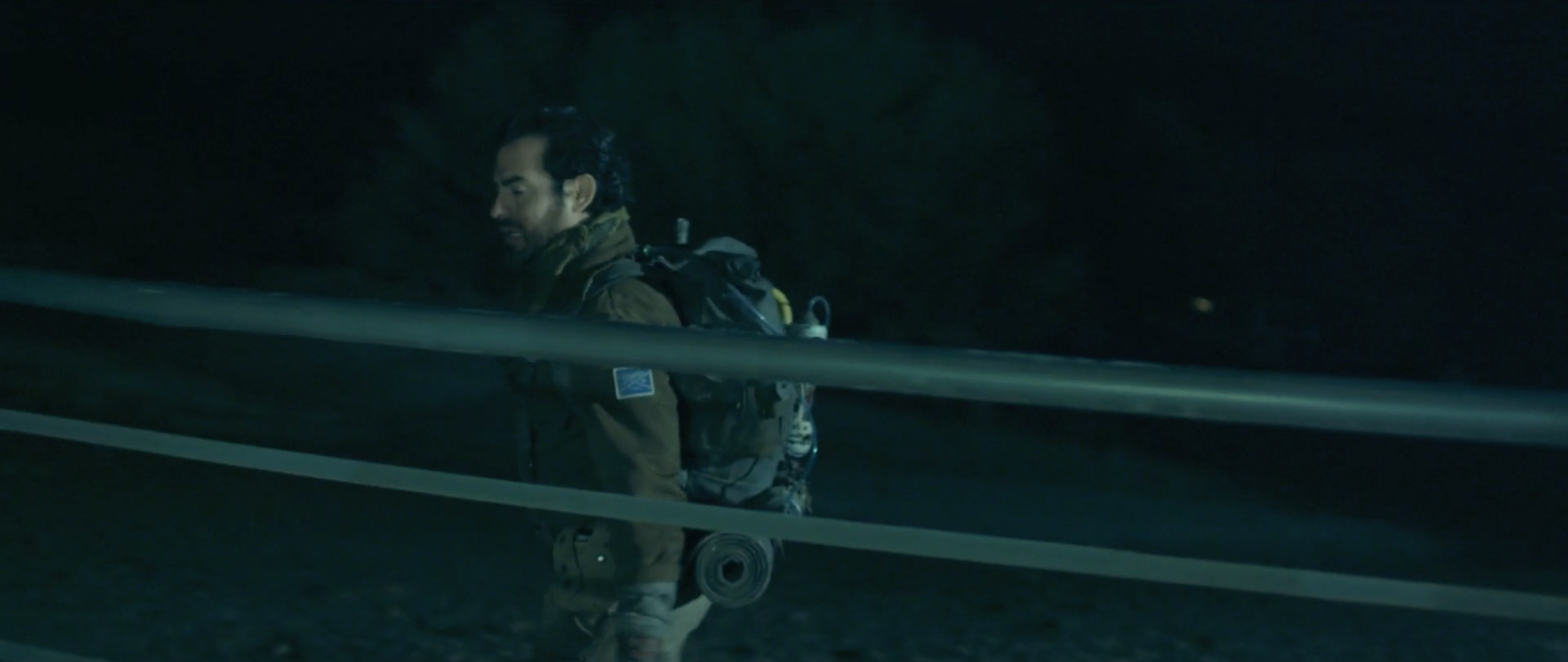
So… yeah. That’s an overview of what my process has been for getting a character from my head into the real world.
A lot of brainstorming, references, concept art, and collaboration from various teammates to make it happen.
I learned a lot through this entire process, and I hope - if you’re a filmmaker reading this - that you find it useful.


